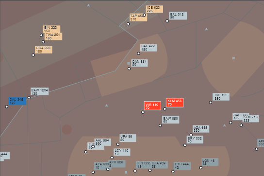
Linda Reynolds hat u.a. ein imposantes Farbschema für die NATS entworfen:
https://www.ingenia.org.uk/ingenia/issues/issue8/Reynolds.pdf
Hier werden schön die unterschiedlichen (Farb-) Schichten erkennbar, die für unterschiedliche Wichtigkeit der Information stehen.
Fig. 5: An experimental air traffic control display in which colour is used to
create a series of visual layers (designed by the author as part of a
research project funded by National Air Traffic Services Ltd
Fig. 8:
The palettes from which the label colours in Figure 5 were selected. Within each set the colours differ only in hue and are not intended to suggest differences in importance. Between sets there are differences in luminance and saturation which are intended to create different levels of emphasi
Im Grunde dasselbe Prinzip, das bei der FAA beschrieben wird…
Federal Aviation Administration’s Requirements for Color
Use in Air Traffic Control Displays by Jing Xing, Civil Aerospace Medical Institute
Federal Aviation Administration Oklahoma City, OK 73125, May 2007


