Only you. Not AI? A cardboard tower at uxcon26

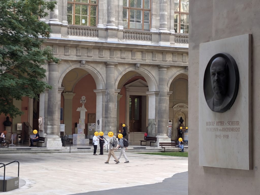
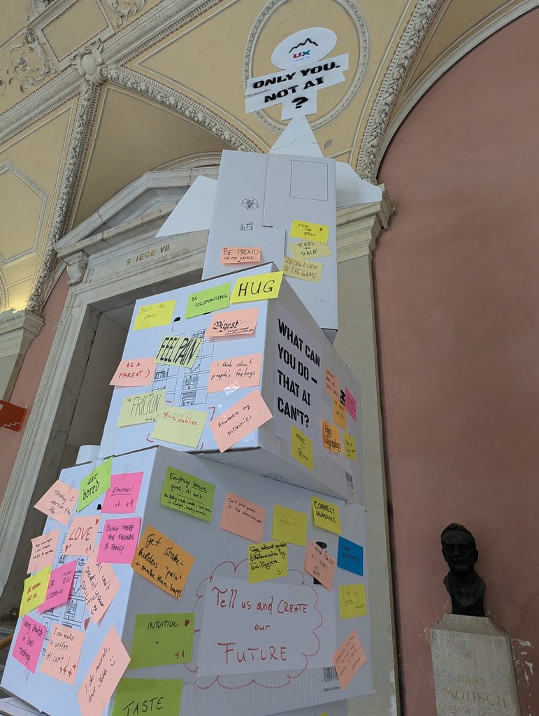
What can I do that AI can’t? You don’t get as far alone on this question as you do together. On the cardboard tower at uxcon26, in the Arkadenhof of the University of Vienna, people posted personal perspectives.

🤝 Built together with Martin Kastler, Thomas Grill, Emanuel Jochum-Zehetner. Thank you Christiane Moser, Johannes Lehner, Kornelia Müller (Hoffmann), Jakob Schnurrer, Max Scheugl for your support!
And thanks to the uxcon organizers Nicole Swoboda and Andreas Ablaßer, and to everyone who left a note.
From the big question to a small one

One question occupied us, as it did many in the UX community in Vienna, Salzburg, Linz and Graz: What is happening to our profession? Will UX be dissolved, taken over, transformed? The UX Community Austria booth at uxcon26 was meant to be the space where this question gets asked. Nobody had to answer it there.
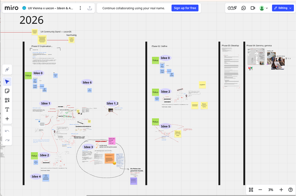
Overview of a Miro board titled “2026 – UX Community Stand – uxcon26”, split by black bars into four columns labeled “Phase 01: Exploration…”, “Phase 02: Define”, “Phase 03: Develop” and “Phase 04: Gemma, gemma”. The first two columns hold numbered idea clusters (“Idee 0” to “Idee 6”) with sketches, sticky notes and green “Fokus” markers. The third column is a text document, and the fourth shows photos.

We turned it into a smaller question that can be answered in one sentence: What can you do that AI can’t?

The concept

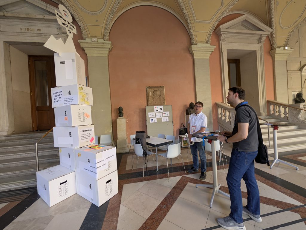
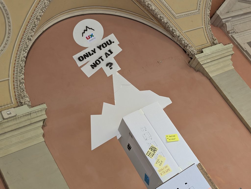
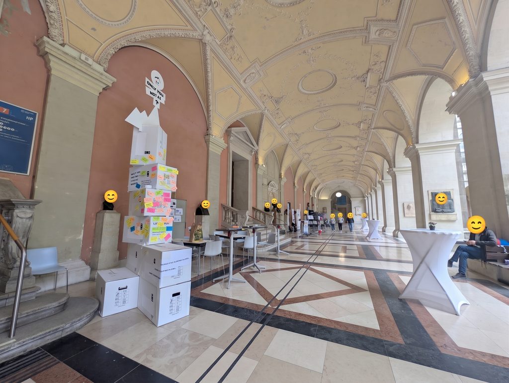
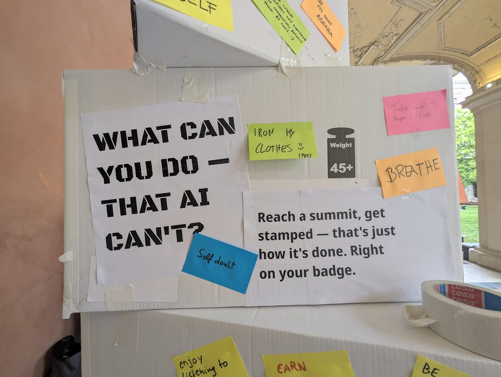
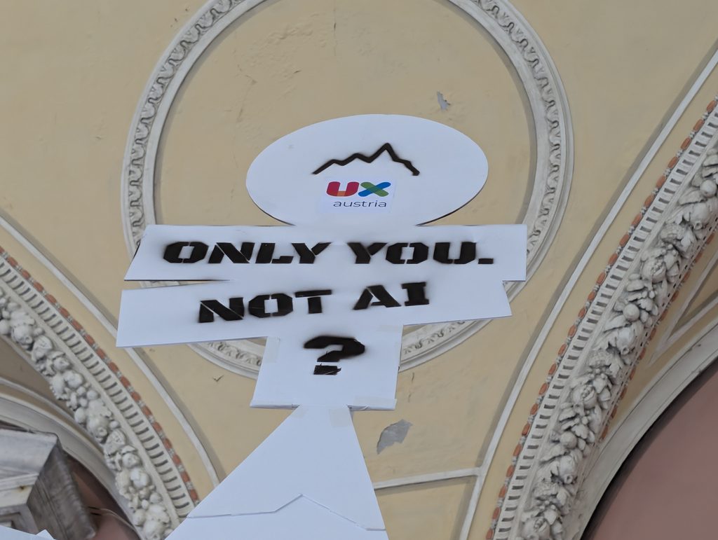
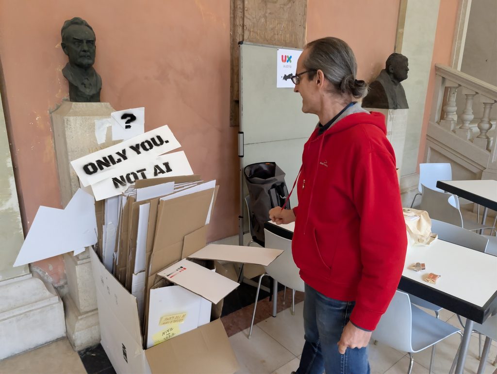
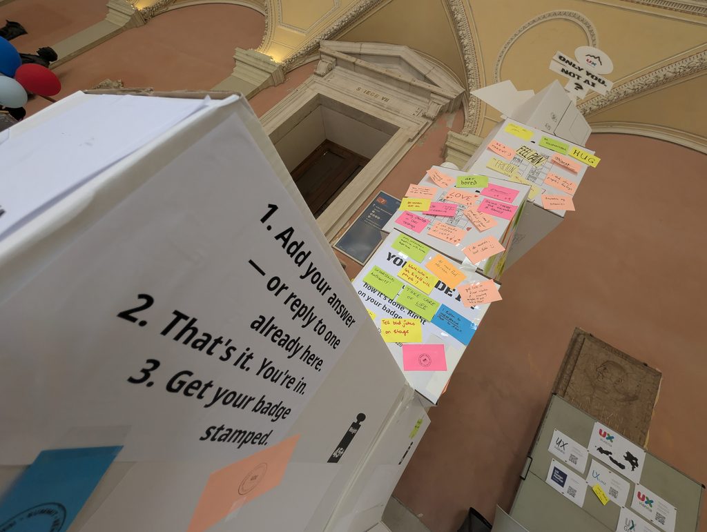
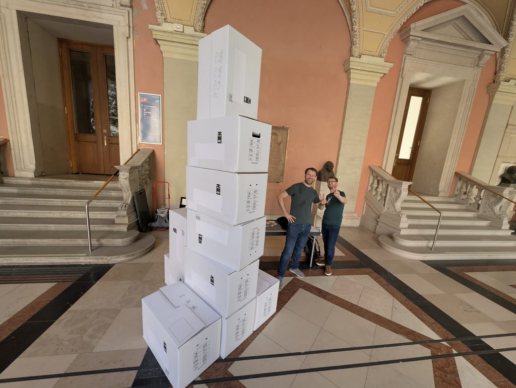
Instead of flyers, we built a cardboard tower. Cardboard costs next to nothing and brings its own mock-up aesthetic. At the very top it said “Only you. Not AI?”, and further down came the actual question: “What can you do — that AI can’t?”.
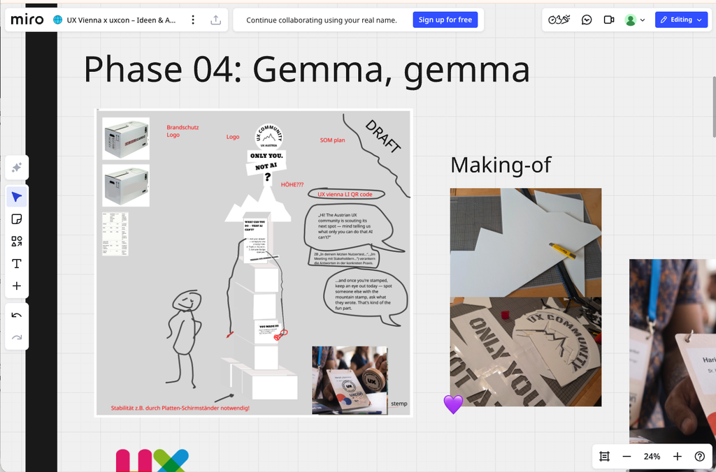
Close-up of “Phase 04: Gemma, gemma” on the Miro board. On the left, a grey sheet marked “DRAFT” shows a sketched cardboard tower topped by the sign “ONLY YOU. NOT AI?”, a stick figure beside it, speech bubbles and red German notes on logo, fire safety, height and stability. On the right, under “Making off”, photos show white cardboard being cut and stencilled letters spelling “ONLY YOU”; a further photo is partly cropped.
How the booth was planned: the Miro board followed the classic design steps – explore, define, develop – and ended with “Gemma, gemma”, Viennese for “let’s go, now!”

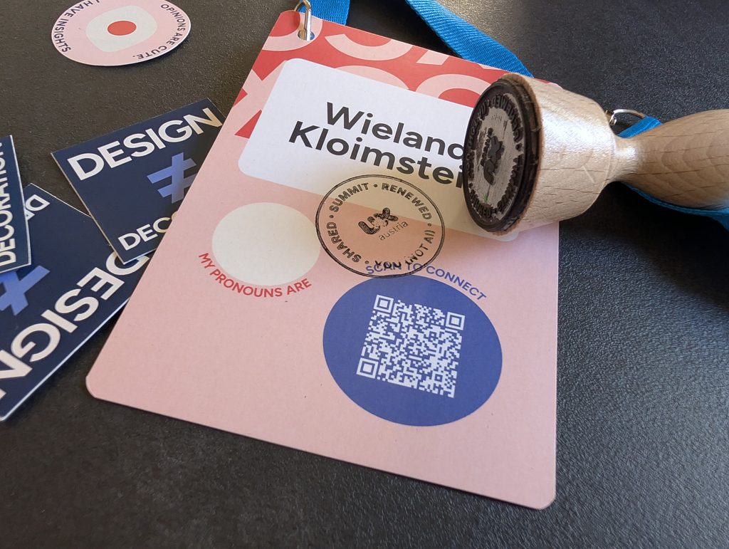
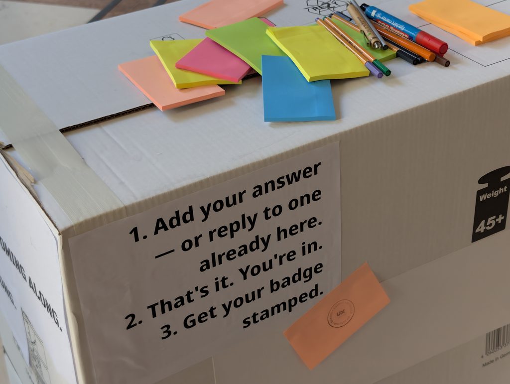
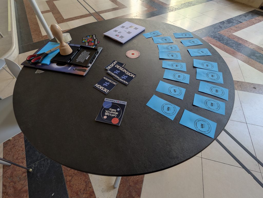
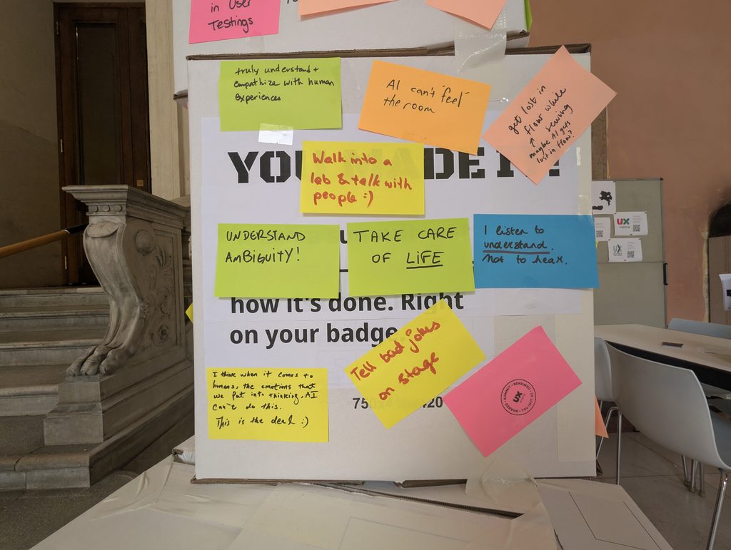
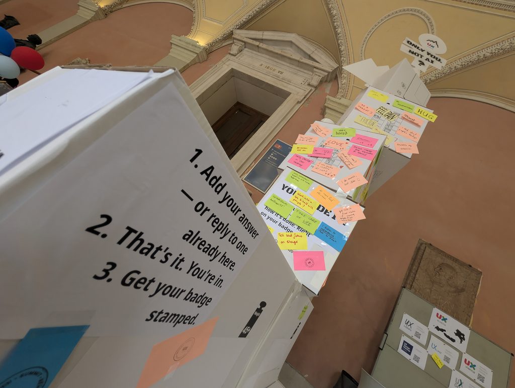
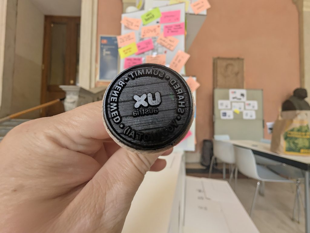
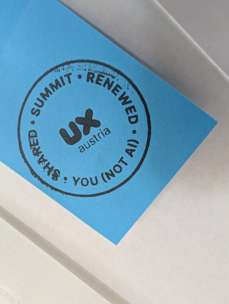
Whoever wrote a Post-it and stuck it on the tower got a stamp on their conference badge, just like at a summit, where in Austria you often find a stamp. The tower said so itself: “Reach a summit, get stamped — that’s just how it’s done. Right on your badge.”
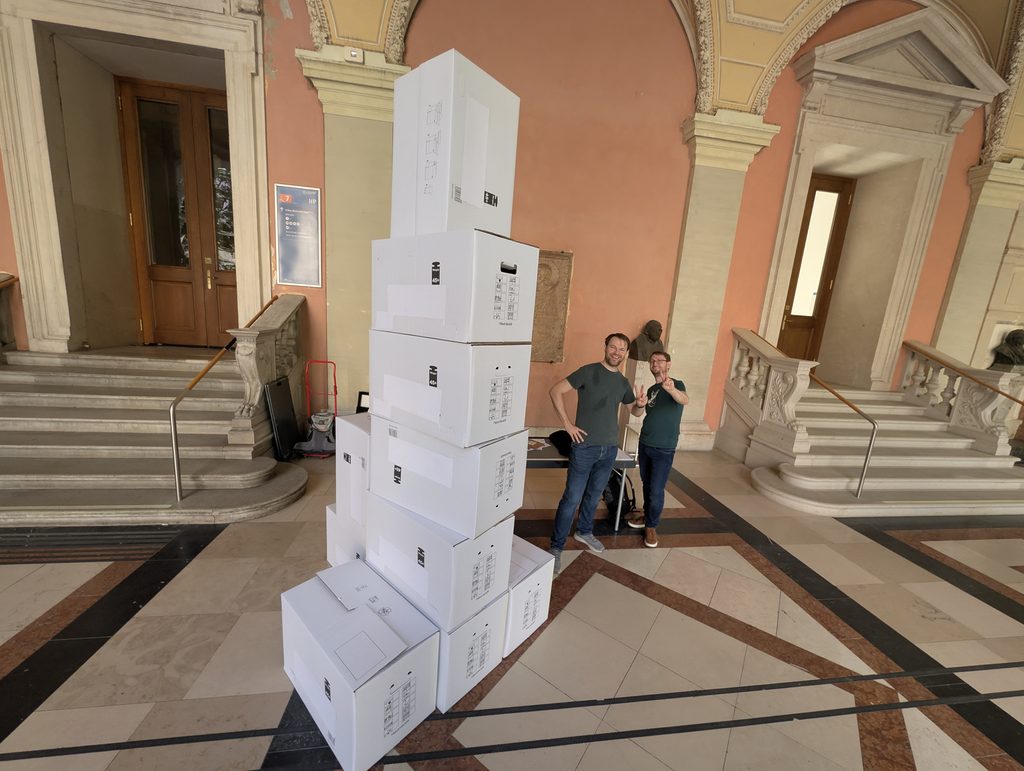
A tower of stacked white cardboard boxes, taller than the two people standing behind it, in a historic stone arcade with peach-colored walls.

For me as a UX designer, it was exciting: a manageable project where you first plan the user experience, imagine how it could be, and then experience up close how it plays out.

How it went

People from Vienna, Salzburg, Graz and other parts of Austria strolled by between sessions. They looked, and laughed at some of the Post-its. We chatted and offered: if you have a perspective in mind, write it down.
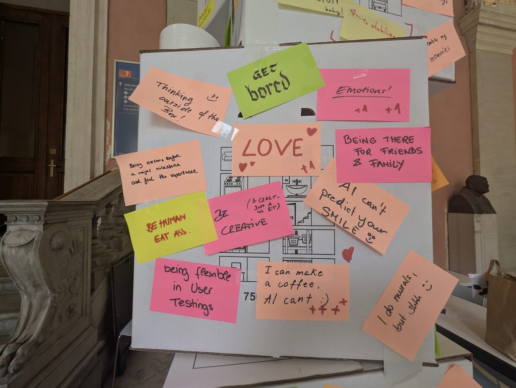
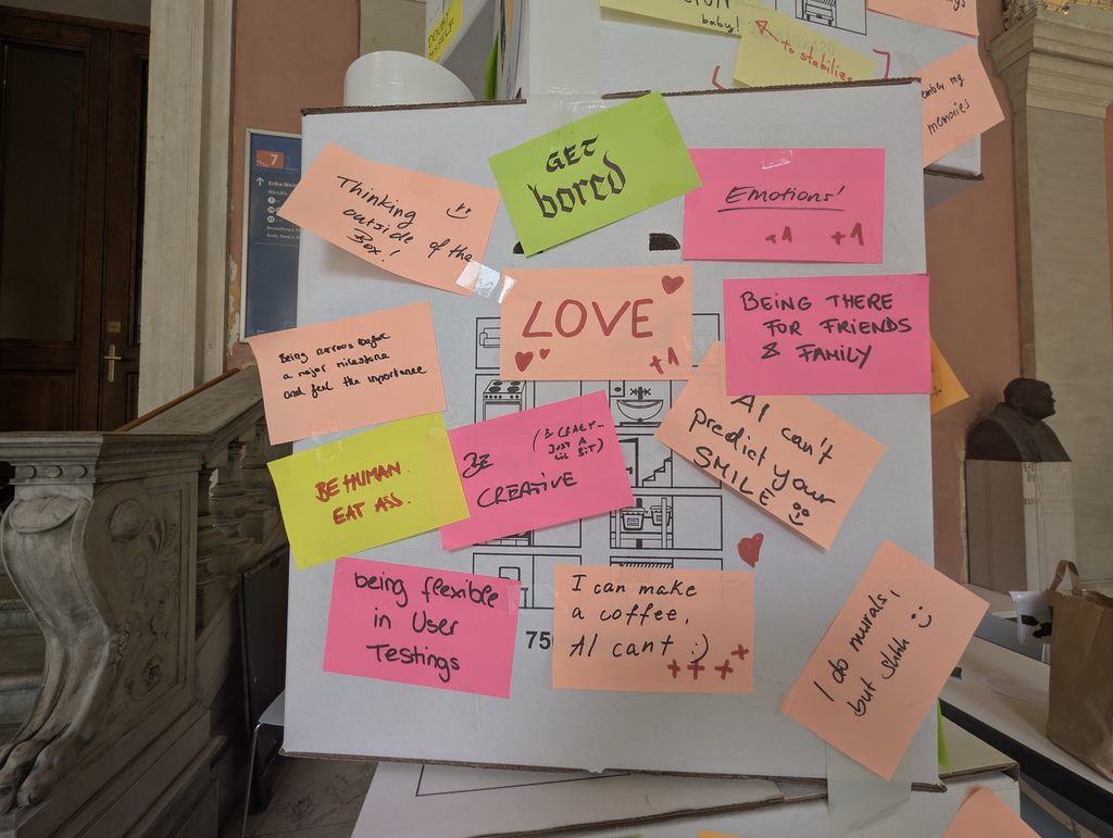
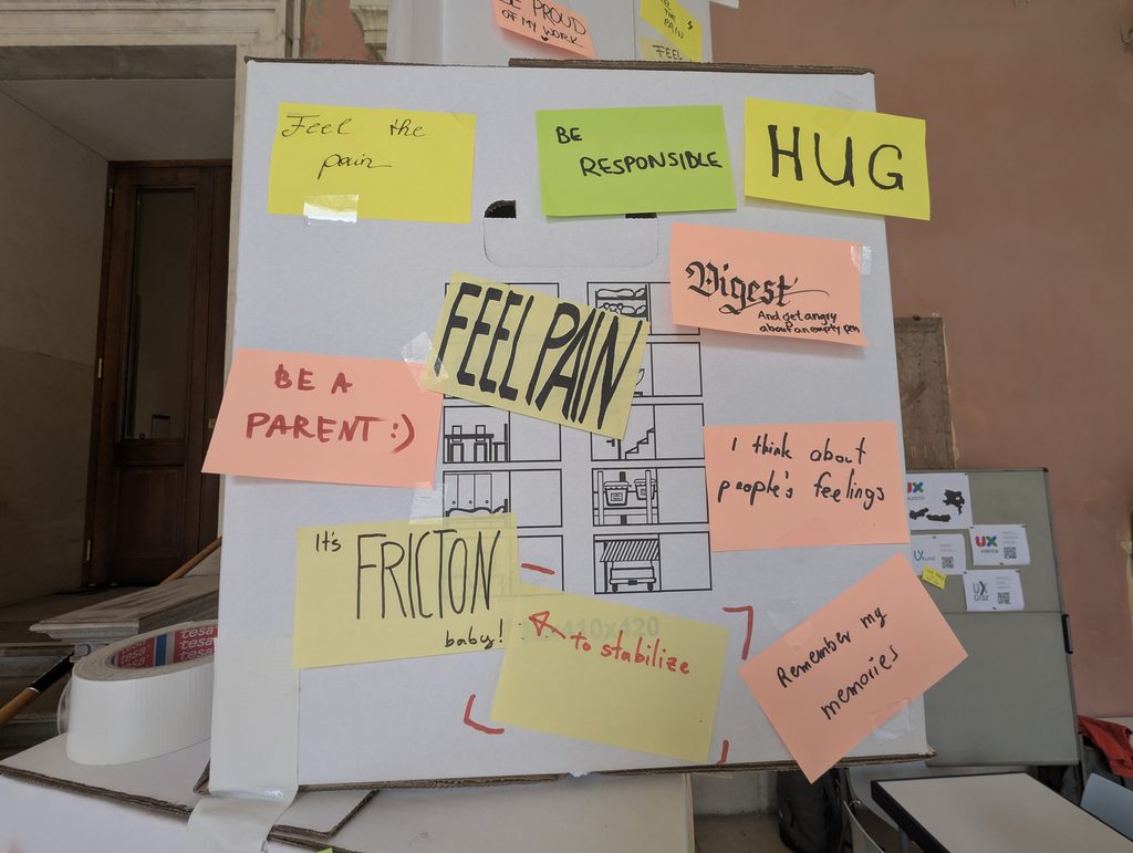
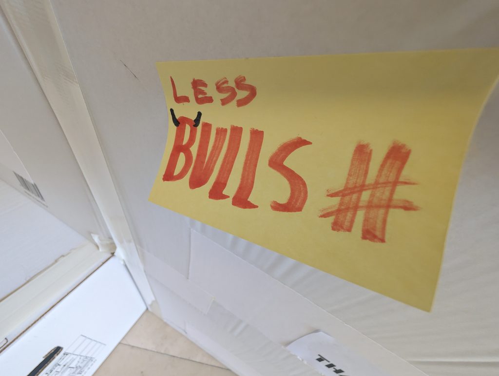
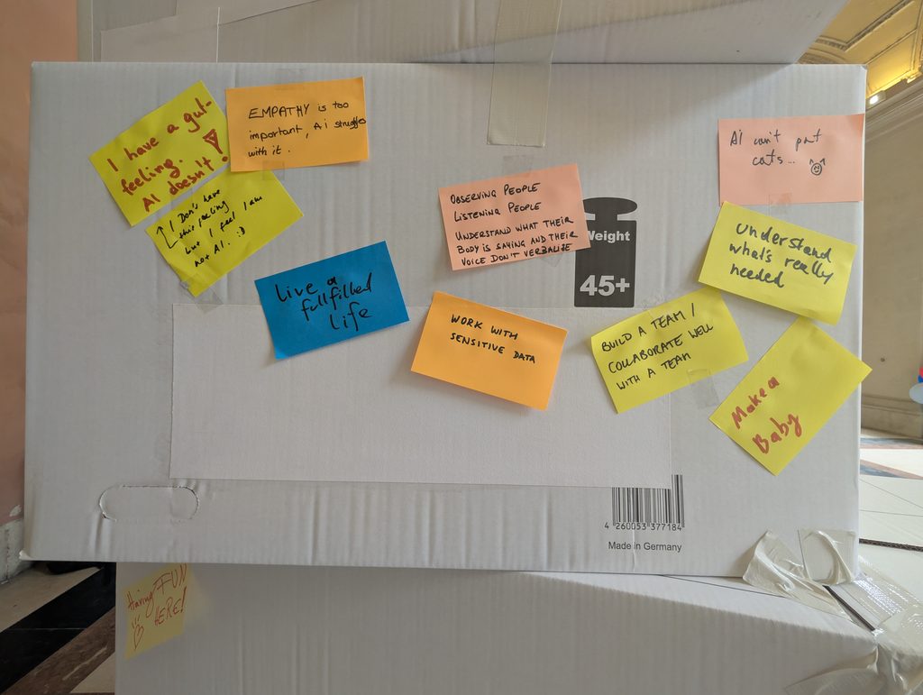
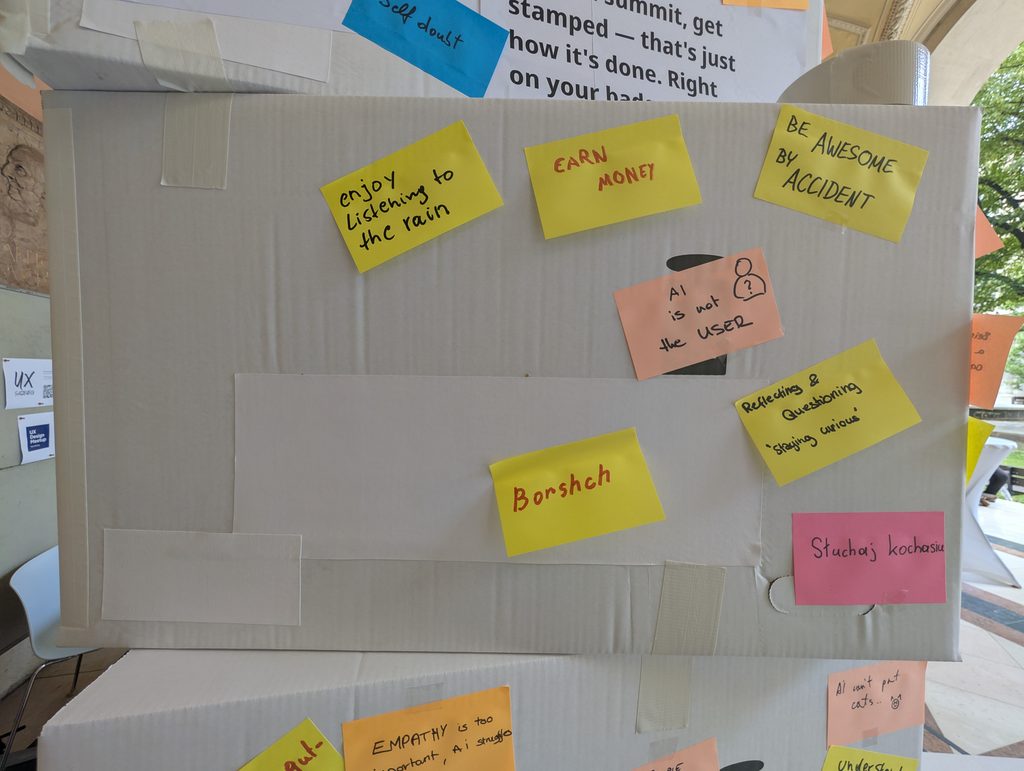
The notes were serious, funny and sometimes surprisingly personal. Some read “AI can’t pet cats…”, “BE HUMAN. EAT ASS.” and “be a great big sister”. It was an experience to watch people think and then read something private.

Hanging right next to each other: “I HAVE TASTE! AI NOT!” and “MAKE KÄSSPÄTZLE” (a cheesy noodle dish). “KNOWING WHAT WE DON’T KNOW” and “OR SHOULD NOT DO!” read together like a single sentence. And “Enjoy Calligraphy” was, of course, written in calligraphy.
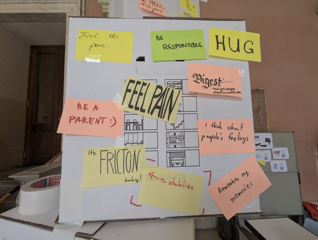
The notes turned into conversations. About “Feel the pain”, someone remarked with a wink that it’s probably not the dream job – feeling pain is no pleasant thing. But that connects to the note “FAILED AND LEARNED FROM IT”: we often learn the hard way – through pain.

One visitor actually liked AI and suggested a second tower: what AI does especially well. I found that right and interesting. There was no second tower, because what AI can do was very present at the conference anyway. Our tower brought in the other perspective.

Where to next?

About 90 notes from people who happened to pass by are not a survey. Asked what only they can do, many wrote about the body, taste, care and responsibility.

Where does all this lead? For me, it’s an exciting time. We enjoy many advantages of AI, and at the same time we have to find out what it can do, what it can’t, and what we can do. Somebody has to set the limits, and somebody has to decide. Design is an important junction for that. It is also where we check how different AI components work together. That takes grounding again and again: checking against reality before building on it.

At uxcon, Meaghan Choi, Design Lead for Claude Code at Anthropic, urged designers in her session to step forward and be active. “Take the lead” was on one of her slides. To me, this is a big challenge, and it lies with all of us. Each of us has to contribute in a fitting way in times of AI so that quality is preserved. Organizations have to give people the space to do so. Sitting back is not an option, neither for individuals nor for organizations. Otherwise products and services get hollowed out by seemingly quick solutions.
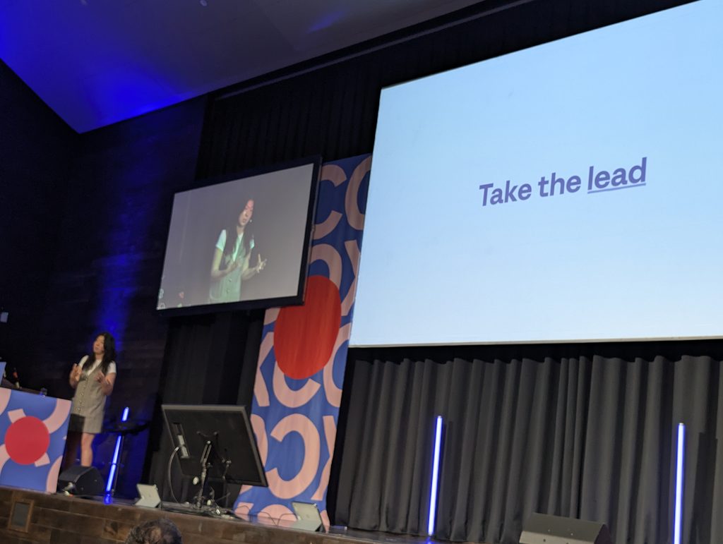
Photo of the slide “Take the lead” with Meaghan Choi
Meaghan Choi, Design Lead for Claude Code at Anthropic, in her session on 17 September

What quick solutions lack is written on one of the notes: “Feel the pain”. A language model is trained to fulfill tasks pleasingly and feels no pain from future maintenance. Design is where a brief gets questioned and where it is decided what not to build.

What stays

The humor often lay in the combination of the notes. And it takes many perspectives to find out what we can do and what this new medium can do. That is what I liked most about it.

Gallery
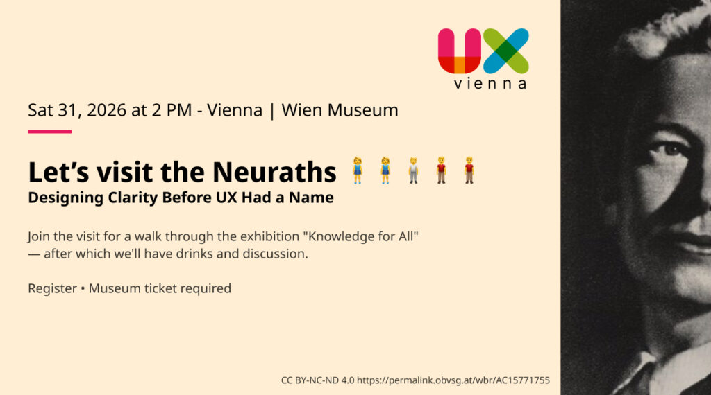
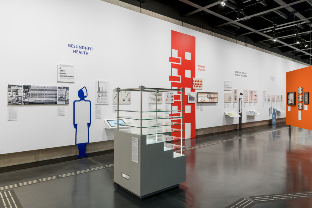
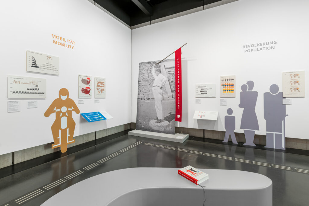
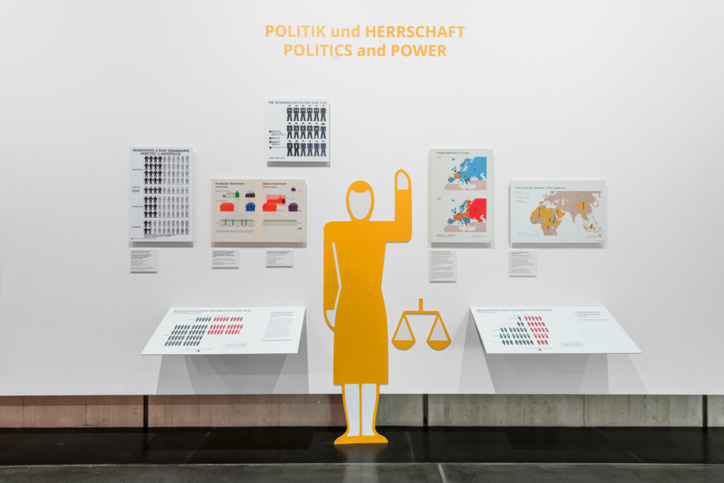
UX VIENNA visits the Neuraths at the Wien Museum 🧍‍♀️🧍‍♀️🧍‍♀️🧍🧍🧍🧍‍♂️🧍‍♂️

Saturday, January 31, 2026 at 2 PM – Wien Museum, entrance

Please register at meetup.com/UXvienna.

If you work in UX, product, service, or information design; data visualization; or user research — or if you simply care about how design shapes understanding — then this event is for you!

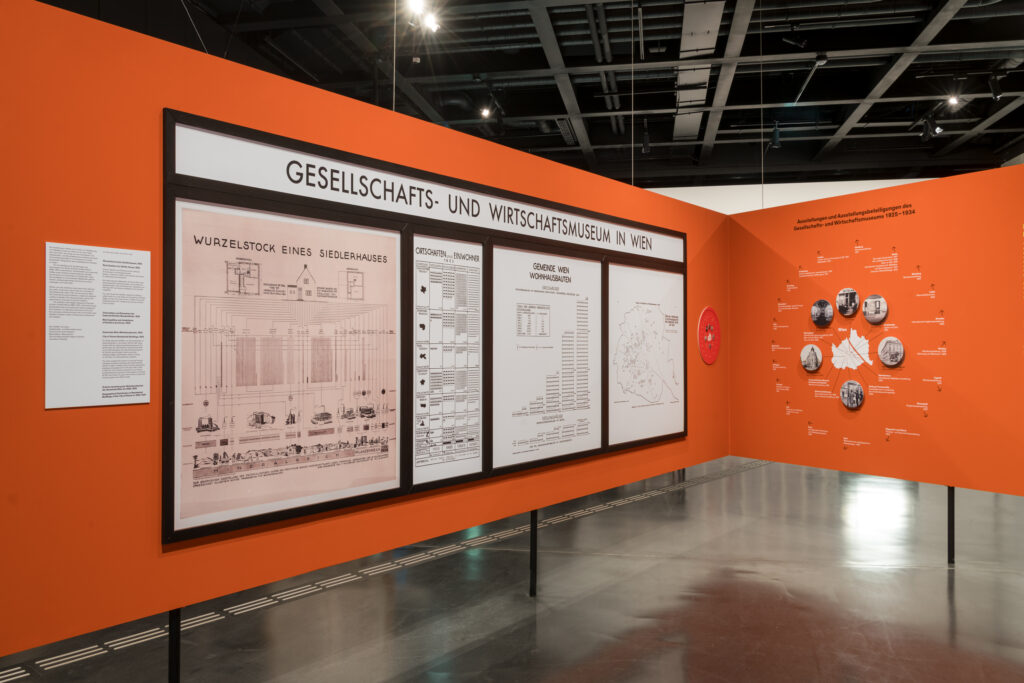
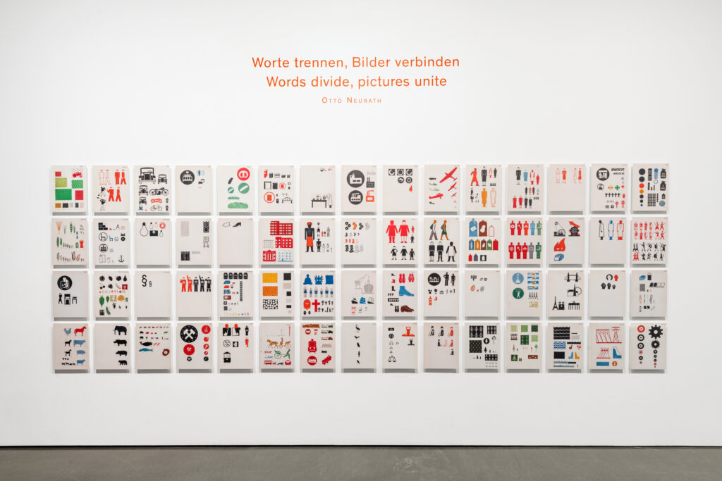
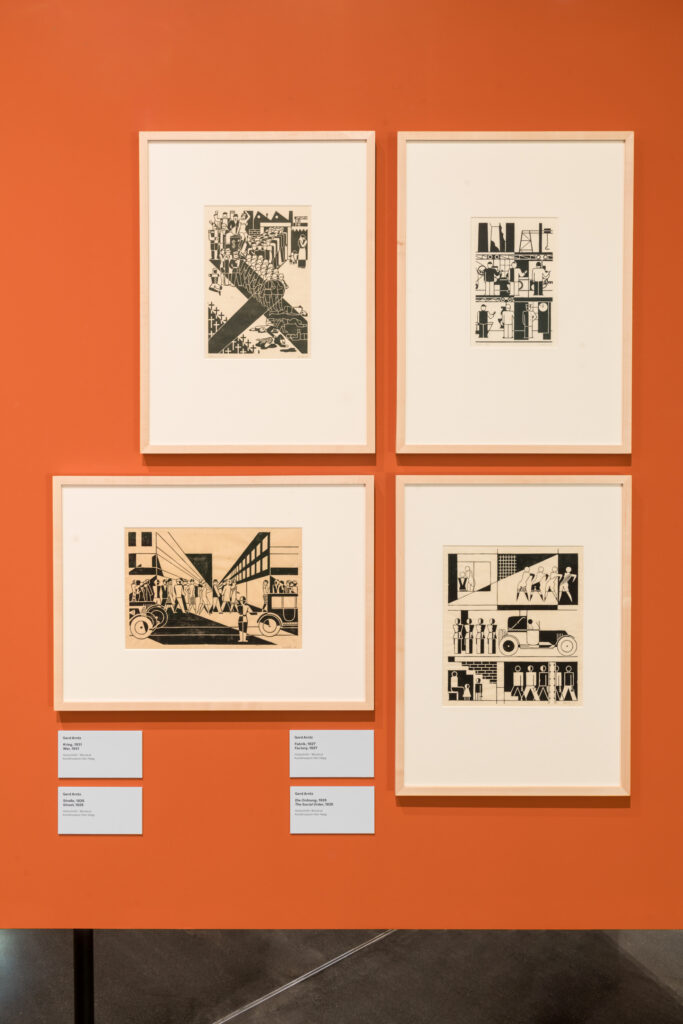
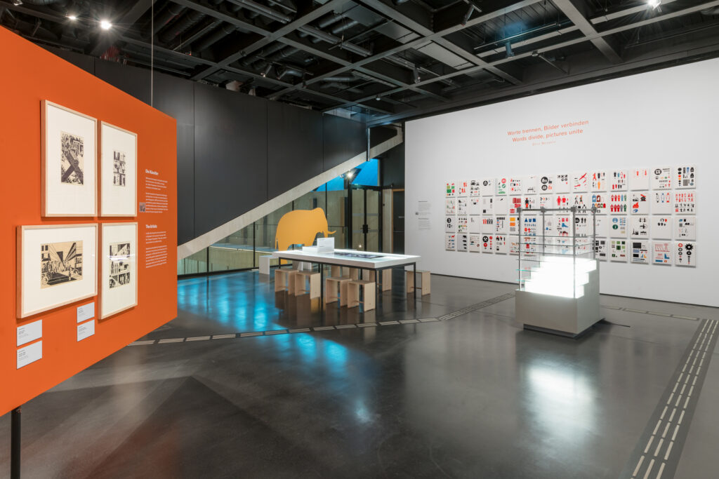
100 years ago in Vienna, Marie and Otto Neurath, along with Gerd Arntz, created the International System of Typographic Picture Education (ISOTYPE), a design system that transforms data into understanding. This was long before UX even existed.

👉 Join us on Saturday, January 31, 2026 at 2 PM
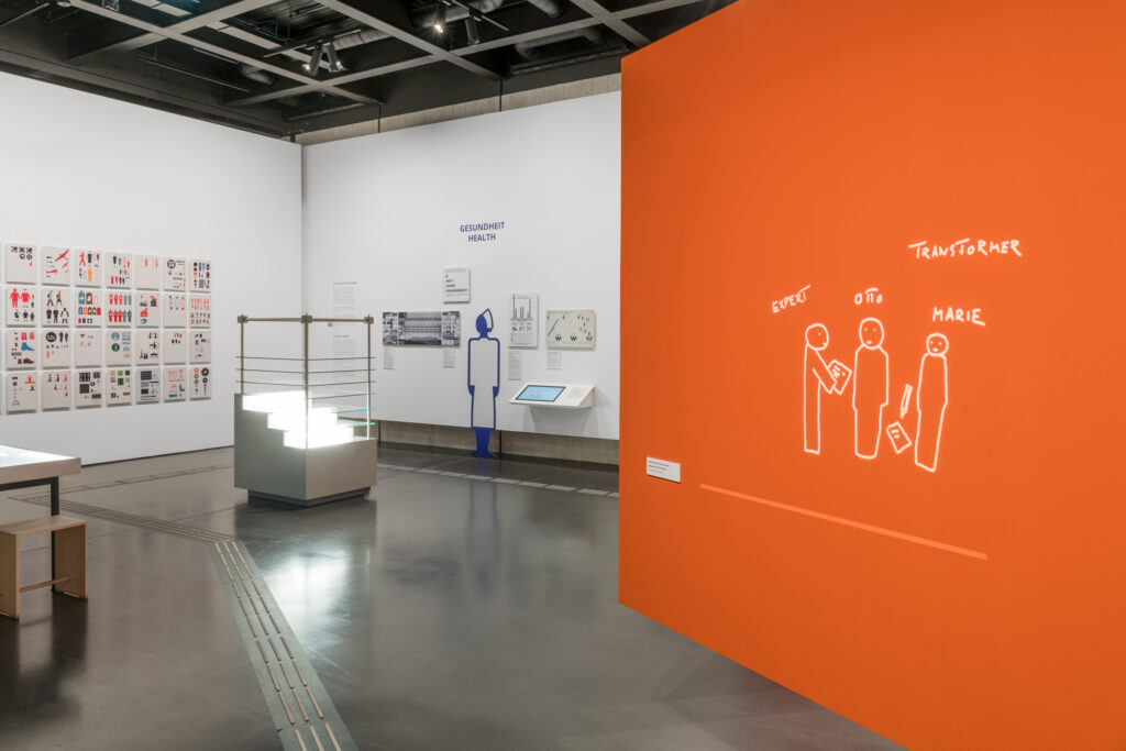
for a group visit to the Neurath exhibition, “Knowledge for All”, at the Wien Museum.

We’ll walk through the exhibition together, after which we’ll have drinks and discuss one central question:

What does it mean to design like this — today?

We’ll connect their ideas to today’s UX practices:

  • How do we design for clarity and accessibility at scale?
  • How do diverse roles align around one shared model of meaning?
  • And, most fascinatingly, how would the Neuraths approach our challenges now?
Action items
  1. Select “Attend” to attend the event
  2. Purchase your special exhibition ticket (only the permanent exhibition is for free)
  3. Meet us at the entrance at 2 PM

Photo copyrights: 
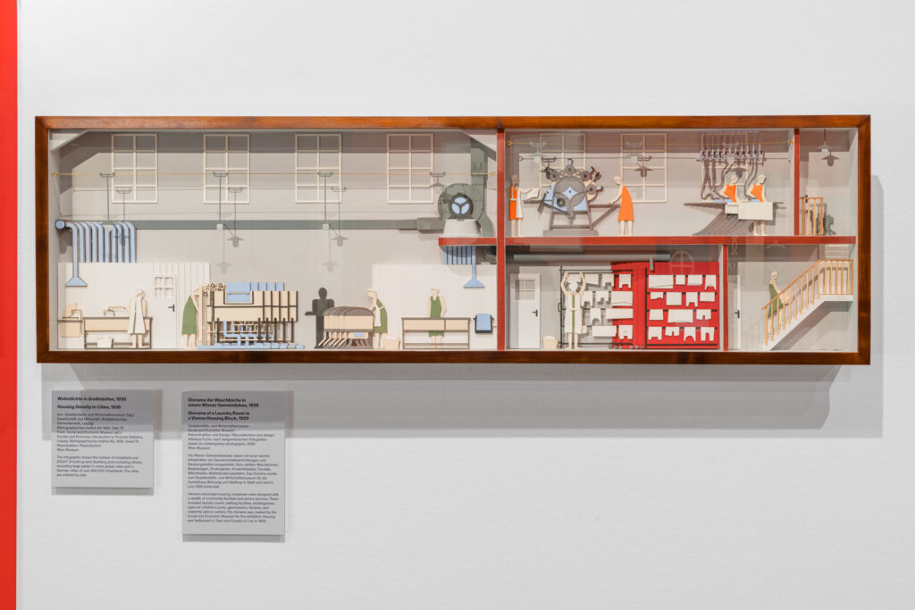
Housing density in cities: © Bibliographisches Institut AG, Leipzig / Gesellschafts- und Wirtschaftsmuseum Wien, Archive: University of Reading – Otto & Marie Neurath Isotype Collection. Marie Neurath: CC BY-NC-ND 4.0 link Photos of the exhibition: Klaus Pichler, Wien Museum

Does form follow function? Mag. Bernd Remsing führt durch das Möbelmuseum Wien

This event is in German language.

Spezialführung durch das Möbelmuseum Wien für Designerinnen, Designer und Designinteressierte. Eintritt plus Spezialführung: €15,50

Gutes Design entsteht im Spannungsfeld zwischen Kunst und Handwerk, zwischen skulpturalem und pragmatischem Anspruch, zwischen der Arbeit für die Sinne und den Notwendigkeiten des Gebrauchs.

Die Führung “Does form follow function?” zeigt anhand einer Auswahl aus den ca. 5.000 Exponaten des Möbelmuseums Wien, wie sich von der Vergangenheit bis zur Gegenwart die Gestaltungsprinzipien zwischen den Polen Repräsentation und Funktion bewegten.

Besprochen werden Beispiele von funktionswidriger Erhöhung bis zu degradierender Nützlichkeit, so etwa ein purpurbeschlagener Leibstuhl in Form eines Thronsessels oder ein zusammenklappbarer Reise-Thron. Irgendwo zwischen diesen kuriosen Extremen muss sie liegen – die goldene Mitte des guten Designs.

Das Möbelmuseum ist eines der weltweit größten Museen für Wohnkultur. Die Spezial-Führung wird von Mag. Bernd Remsing gehalten.

Anmeldung:
https://www.meetup.com/de-DE/uxvienna/events/290720192/

————————

This event is in German language. Questions in English are possible.

Special guided tour “Does form follow function?”.

Good design is created in the field of tension between art and craft, between sculptural and pragmatic demands, between work for the senses and the necessities of use.

The guided tour “Does form follow function?” uses a selection from the approximately 5,000 exhibits in the Furniture Collection Vienna to show how, from the past to the present, design principles have moved between the poles of representation and function.

Examples are discussed ranging from non-functional elevation to degrading usefulness, such as a purple-trimmed personal chair in the form of a throne chair or a foldable travel throne.

Somewhere between these curious extremes must lie the golden mean of good design.

The Furniture Museum is one of the world’s largest museums of home decor. The special guided tour will be held by Mag. Bernd Remsing.

Registration:
https://www.meetup.com/de-DE/uxvienna/events/290720192/

Update:
Rückblick auf die UX-Spezialführung im Möbelmuseum Wien

Addendum 161. UX Vienna Meetup

Photos from the 161. UX Vienna Evening Meetup (formerly Interaction Design Stammtisch)

Special thanks to Katharina Gesell and Benjamin Simsa from A1 Telekom Austria with the talk about the design process for the new A1 (selfcare) app and Armin Wagner with “Don’t Make Me Design Think”

Hosted by: A1Telekom

Continue reading Addendum 161. UX Vienna Meetup

151. interaction design stammtisch

tuesday, 11th of july 2017, 7pm
at metalab, 1010 wien, rathausstrasse 6
(public transportation: u2 rathaus, 1/2/D stadiongasse/parlament)

we will continue with the new format:
7pm–9pm: short slots (30 min) for each topic
from 9pm: open discussions, get-together, focusing on previous topics …

topics for this meeting:

  • wieland will talk about photography and UX – a blindspot
  • … your topic? …


Continue reading 151. interaction design stammtisch

GoGoColor ist online!

Das vorab beim UX-Stammtisch präsentierte Design für einen Farbwähler ist online: http://gogocolor.com

GoCoColor ist ein Design für einen Farbwähler der sich an den empfundenen Eigenschaften der menschlichen Wahrnehmung, Farbe, Sättigung und Helligkeit orientiert und steht für Entwickler unter einer CC Lizenz (BY-NC-SA 3.0 AT).

  • Die empfundenen Eigenschaften der menschlichen Wahrnehmung, Farbe, Sättigung und Helligkeit, können direkt ausgewählt werden.
  • Nur zwei Punkte definieren die 3 Eigenschaften unserer Wahrnehmung.
  • In der Mitte kann die ausgewählte Farbe als Fläche beurteilt werden und ist von störenden Farbkontrasten bestmöglich entfernt.
  • Das Design ist kompakt und integriert sich gut in unterschiedliche Anwendungen. Durch die optimale Nutzung der Bildschirmfläche steht viel Fläche für eine präzise Auswahl zur Verfügung.
  • Schaut gut aus

GoGoGolor basiert auf keinen neuem perzeptuellen Farbmodell, sondern das Verhalten des Farbwählers ergibt sich aus der Interaktion.

gogocolor

http://gogocolor.com

One-Slide-Show

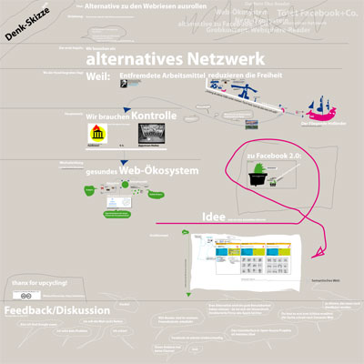
Am Stammtisch wurde die One-Slide-Show besprochen,: alternativen zu den Webriesen – Wie ein Netze-Netz das Web-Ökosystem bereichern könnte.

Die Präsentation ist ein Zooming user interface Experiment. Vernetztes Denken geschieht durch das Vernetzen von Themen > mehr dazu: Tufte über Powerpoint – powerpoint ist böse.

Erstellt wurde das PDF mit Adobe InDesign CS4. ID CS5 hat ein paar Interaktions-Features dazu bekommen die ich noch testen werde.

Die Diskussion über mögliche Alternativen geht beim Schockwellenreiter weiter.